Candlesticks Explained: A Comprehensive Guide for Traders and Investors 2026

Trading demands thorough preparation, such as market analysis, research, and strategy development. Candlesticks, a key tool for traders, assist in assessing price action for optimal trade entry and exit points. While understanding candlestick charts may be challenging for beginners, this guide explains their significance in trading. Continue reading for clarity.
-
-
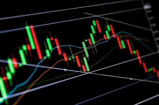
Understanding the Basics of Candlestick Charts
Candlestick patterns hold significant power in the world of financial markets, recognized as a potent tool for traders while trading on the best paper trading apps. These patterns are formed by the upward and downward price movements that occur within the market. Although these price fluctuations may appear random, they often manifest in specific patterns that traders utilize for analysis and trading purposes.
Today, these charts have gained prominence as the preferred analytical tool, as they offer a comprehensive representation of all the essential information at a single glance. Candlesticks enable traders to assess market trends and identify potential entry and exit points. To comprehend the concept of Candlesticks, we need to review its origin and significance in modern trading.
Origins and Historical Context
Candlestick charts trace their origins back to 18th century Japan, where Munehisa Homma, a prominent Japanese rice dealer, introduced them. Homma, known as the “God of Markets,” employed these charts to analyze and predict fluctuations in rice prices. He achieved the charts by examining the interaction between traders’ emotions and the supply and demand of rice.
Over time, candlestick charts have improved and expanded in terms of pattern recognition and interpretation. The credit for this development largely goes to Steve Nison, an American trader who played a pivotal role in popularizing candlestick analysis in Western financial markets.
Nison extensively researched and built upon the studies conducted by Munehisa Homma, incorporating new candlestick patterns. His publication in 1991, titled “Japanese Candlestick Charting Techniques,” is now considered a revered classic that significantly contributed to the widespread adoption of candlestick charts among Western investors.
Interestingly, candlesticks now cover several aspects of trading and have become popular recently due to several financial trends. They have found widespread usage among traders, investors, and technical analysts in various financial markets, such as stocks, commodities, and currency.
Importance of Visual Representation in Trading
In the financial trading world, a massive volume of data is processed by analysts and investors every second. This data covers stocks, bonds, indices, cryptocurrency, and commodities. While fundamental and technical analysis often takes precedence, the potential of visual representation is frequently overlooked.
Visuals play a pivotal role in aiding traders in the analysis of market data. They serve as depictions of the market patterns, providing traders with information that enables them to come up with good decisions.
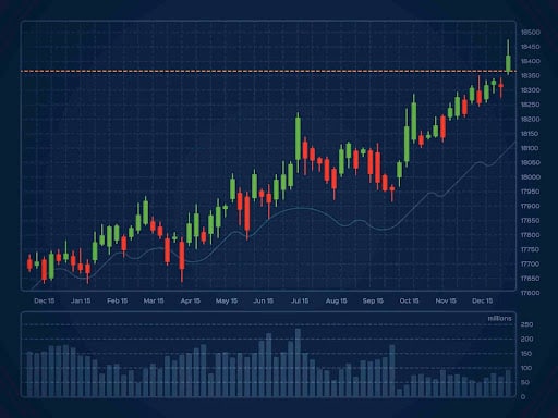
The candlestick chart ranks as one of the most used visual tools. The chart provides a visual depiction of how prices have changed over a certain period, with each candlestick corresponding providing information about the highs and lows of assets. Through the analysis of candlestick patterns, traders can effectively identify potential market behavior and reactions.
Your capital is at risk
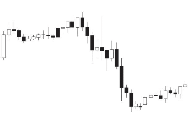
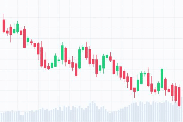
Components of a Candlestick
To analyze price patterns using candlesticks, understanding the components and their significance is essential. Candlestick patterns result from combining data from different price points within a specific timeframe. These patterns, represented by various candlestick shapes, provide insights into market sentiment, enabling technical analysts to determine optimal entry and exit points for trades. The main components of a candlestick pattern are:

Body, Wick, and Tail
A candlestick consists of the body, wick, and tail. The body, the most prominent part, represents the price range between the opening and closing prices of an asset within a specific period. This period ranges from a day to months, depending on the chart settings.
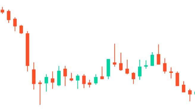
To interpret the data represented by the body, a black or red body indicates that the close was lower than the open, while a white or green body indicates that the close was higher than the open. The colors may vary based on traders’ preferences and charting platforms.

Besides the body, there are upper and lower wicks, known as shadows. The upper wick represents the highest price reached during the selected period, while the lower wick represents the lowest price.
There won’t be a wick if the open or close price is the same as the high and low. Therefore, the wicks illustrate the difference between the opening and closing prices, while the body reflects the overall price change of a trading pair.
Open, High, Low, and Close (OHLC)
The OHLC chart visualizes the open, high, low, and close prices, showcasing the price momentums between certain periods. It consists of one vertical line and two horizontal lines. The vertical line represents the high and low, while the left horizontal line indicates the open price, and the right horizontal line represents the closing price, forming a bar structure.
A significant gap between the open and closed lines indicates strong momentum, while a smaller gap suggests weak momentum or indecision. The high and low lines provide insights into market volatility, representing the entire price range during the period.
Why Candlestick Charts Matter in Technical Analysis
There are several reasons to make use of candlesticks during technical analysis on the best stock and penny stock apps. Although they might not be the first choice of traders, they definitely make trading decisions easier, as they allow for quick interpretation and analysis of market trends. Here, we discuss two major reasons why traders and investors should incorporate candlestick charts into technical analysis.

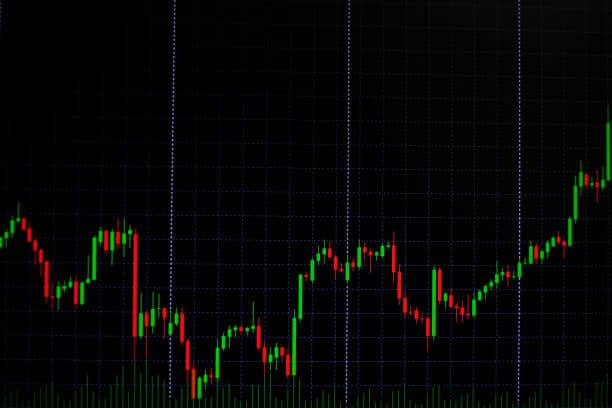
Visualization of Price Movements
Sorting and analyzing price data to determine trading pairs’ price movements can be a time-consuming task. Candlesticks provide a solution by offering a snapshot of the data through colorful charts. They enable analysts to quickly assess whether a market’s price movement is positive or negative.
With a glance, one can see the highest and lowest price an asset reached during a specific period, as well as its opening and closing prices simultaneously. Candlesticks simplify the process by condensing extensive price data into easily interpretable visuals.
Identifying Patterns and Trends
Experienced traders recognize the multifaceted nature of candlesticks beyond representing periodic price movements. Candlestick data serves as a valuable tool for identifying price patterns, analyzing market trends, understanding general market sentiment, and predicting future market actions.
For example, a green candle signifies bullish, while a red indicates a bearish. Additionally, a candle with a long wick at the bottom may suggest that traders are buying more of an asset as its price falls. Conversely, a candle with a long wick at the top suggests that traders are selling their assets to secure profits before a possible price decline.
Bullish and Bearish Candlesticks
Price movements, although occasionally appearing random, often give rise to patterns used by traders for analysis and trading purposes. These patterns can be categorized into two distinct types: bullish and bearish. Let’s now examine the defining characteristics of each trend.

Characteristics of Bullish Candlesticks
The Bullish candlestick pattern derives its name from the behavior of Bulls, who use their horns to swing themselves upwards towards other animals. In the context of trading, Bullish candlesticks signify an upward trend.
Usually indicated in white or green, their presence indicates that more buyers have entered the market compared to sellers, leading to an increase in price. Notably, if a Bullish candlestick exhibits a substantially lower shadow, it suggests a significant influx of sellers.
Characteristics of Bearish Candlesticks
The Bearish candlestick pattern derives its name from the behavior of bears, who employ their claws to strike down other animals. In financial trading, Bearish candlesticks indicate a downward trend.
Usually indicated in a long body of red or black, their presence signifies that more sellers have entered the market compared to buyers, resulting in a decline in price. If a Bearish candlestick displays a significant upper shadow, it suggests a notable resistance from buyers.
Bullish Candlesticks Bearish Candlesticks Long white/green candlesticks indicate strong buying pressure. Long black/red candlesticks indicate significant selling pressure. Hammer candlestick pattern suggests a potential bullish reversal. Hanging man candlestick pattern suggests a potential bearish reversal. Bullish engulfing pattern occurs when a smaller bearish candlestick is followed by a larger bullish candlestick. Bearish engulfing pattern occurs when a smaller bullish candlestick is followed by a larger bearish candlestick. Piercing pattern candlestick indicates a potential bullish reversal. Dark cloud cover candlestick indicates a potential bearish reversal. Your capital is at risk
Common Single Candlestick Patterns
When performing technical analysis on the best options apps, it is crucial to familiarize oneself with a wide range of candlestick patterns. These patterns hold varying interpretations, and in the following section, we will emphasize the most frequently employed ones.
Candlestick pattern Doji and Its Variations
The Doji candlestick pattern can exhibit either a Bullish or Bearish nature. It emerges during periods of substantial buying and selling activity in financial assets. This pattern arises when the demand and supply of a market are in equilibrium, effectively canceling each other. The Doji candlestick can be further classified into five categories based on which party, whether buyers or sellers, gains control initially.
Doji Pattern Description Doji Star Doji followed by a gap in the opposite direction, indicating potential reversal. Long-Legged Doji High volatility, small body, significant indecision in the market. Dragonfly Doji Long lower wick, no upper wick, potential bullish reversal. Four Price Doji Rare pattern with equal opening, closing, high, and low prices, indicating extreme indecision. Gravestone Doji Long upper wick, no lower wick, potential bearish reversal. Hammer and Shooting Star
The Hammer pattern signifies a bullish reversal and typically appears at the conclusion of a downtrend. It is characterized by a small body positioned at the upper end of the trading range and a long lower shadow. This configuration indicates that sellers initially held control, but eventually, buyers managed to drive the price higher.
The Inverted Hammer pattern is another bullish reversal pattern commonly observed at the conclusion of a downtrend. It features a small body positioned at the lower end of the trading range and a long upper shadow. This indicates that buyers made an attempt to drive the price higher, but ultimately, sellers regained control.
The Shooting Star pattern denotes a bearish reversal commonly observed at the conclusion of an uptrend. It is characterized by a small body positioned at the lower end of the trading range and a long upper shadow. This configuration suggests that buyers initially drove the price higher, but eventually, sellers regained control.
Basic Candlestick Patterns
To traders using the best stock tip services, market price movements are not random but rather patterns that can be analyzed and incorporated into their strategies. Candlestick patterns, whether bullish or bearish, represent these patterns. Below, we present an overview of the fundamental candlestick patterns.

Engulfing Patterns: Bullish and Bearish
The bullish engulfing pattern signifies a market trend where buyers surpass sellers. This pattern is characterized by a long real body engulfing a small body, indicating that bulls have control and the asset’s price may rise. Conversely, a bearish engulfing pattern emerges during an uptrend when sellers outnumber buyers. Typically, the candle exhibits a long real body engulfing a small body, signifying that sellers have control and the asset’s price may begin to decline.
Harami Patterns: Bullish and Bearish
The Harami pattern signifies a market condition where signals can be either bullish or bearish, depending on the timeframe. This pattern is characterized by a small real body (green or white) contained within the larger real body of the previous day.
A bullish Harami suggests a pause in a downtrend, potentially indicating an upcoming upward movement if the trader waits for another day. On the other hand, a bearish Harami indicates uncertainty among buyers.
If the price of an asset rises following the pattern, the uptrend may continue. However, if a downward candle follows the bearish Harami, it suggests a potential downtrend.
Continuation Candlestick Patterns
Continuation candlestick patterns, which underpin one of the most widely employed strategies, indicate that the current trend is expected to resume once a momentary pause concludes and the breakout is validated. The following are some commonly observed continuation candle patterns;

Flag and Pennant Patterns
The flag formation found on the best stock analysis apps occurs following a sharp upward or downward movement before entering a consolidation phase between two parallel lines. Eventually, a breakout confirms the direction of the prevailing trend.
During an uptrend, the bullish flag pattern emerges. After an initial upward move, the price consolidates within the parallel lines before breaking out to higher levels. The bear flag pattern facilitates the continuation of a downtrend. Following a brief consolidation in a minor uptrend, sellers regain control, leading to a breakdown of the flag.
Similar to the flag, the pennant pattern begins with a strong, rapid movement upward or downward. However, instead of consolidating within parallel lines, the price action forms a triangular shape during the consolidation phase.
The bearish pennant serves as a continuation pattern, extending the downtrend. On the other hand, the bullish pennant occurs within an uptrend. After consolidation, buyers push the price action higher, prolonging the prevailing bullish trend.
Symmetrical Triangles
The symmetrical triangle is a pattern that suggests a period of consolidation before the market price experiences a breakout in either an upward or downward direction. Traders using the best forex apps can utilize this triangle to identify optimal entry and exit points. However, it should be noted that the symmetrical triangle is a neutral pattern, lacking both ascending and descending lines that would indicate specific bullish or bearish trends.
Reversal Candlestick Patterns
Reversal patterns are the opposite of continuation candlestick patterns. While continuation patterns indicate that the prevailing trend is likely to continue after a temporary pause and breakout confirmation, reversal patterns suggest an imminent change in the trend direction. Reversal patterns typically require more time to form compared to continuation patterns, as it is generally easier for the market to maintain its current direction rather than reverse course. Here are two major types of reversal patterns.
Head and Shoulders Patterns
The head and shoulders pattern forms when the price of an asset reaches its highest point and subsequently returns to the base price before experiencing an upward trend. This pattern serves as an indication of a reversal from a bullish trend to a bearish trend, effectively informing traders that the asset has already reached its peak.
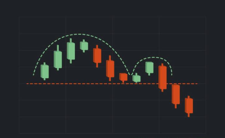
Double Top and Double Bottom Patterns
The double-top pattern resembles an “M” shape and indicates a reversal from a bullish trend to a bearish market. On the other hand, the double bottom pattern forms a “W” shape and signifies a shift to a bullish price movement after a period of downtrend.
Combination with Technical Indicators
Combining candlestick charts with indicators is always the recommended approach for developing a robust technical or quantitative trading system for the best commodity trading apps. It is advisable for analysts to thoroughly examine the market using candlestick patterns in conjunction with other technical indicators.
Using Moving Averages with Candlestick Patterns
A widely used analysis tool for monitoring asset price movements is the moving average (MA) chart, which calculates the average price over a specific period. By combining moving averages with candlestick patterns, you can pinpoint the beginning of your analysis. When the price remains above the moving average, it signals a general uptrend, while staying below suggests a downtrend. Utilizing both analysis tools enhances traders’ understanding of the market direction.
Incorporating RSI and MACD for Confirmation
Technical analysts, particularly day traders on the best day trading apps, employ the relative strength index (RSI) and the moving average convergence divergence (MACD). The MACD identifies the overall trend direction, while the RSI pinpoints price swings. Both indicators offer signals to traders, serving to validate predictions derived from candlestick and moving average patterns. This approach allows the confirmation of price momentum through diverse indicators.
Technical Indicator Use Moving Average (MA) Smooths out price data to identify trends and potential support/resistance levels. Relative Strength Index (RSI) Measures the speed and change of price movements to identify overbought or oversold conditions. Moving Average Convergence Divergence (MACD) Shows the relationship between two moving averages to identify potential trend reversals. Bollinger Bands Measures volatility and identifies potential overbought or oversold conditions. Your capital is at risk
Developing Candlestick-Based Trading Strategies
Candlestick patterns serve as vital tools in trading’s technical analysis, offering a foundational element for effective trading strategies. They happen to be the best stock trading signals and their integration with additional technical indicators enhances the robustness of these strategies. Combining candlestick patterns with indicators like moving averages provides traders with a more comprehensive market perspective. Here’s how to do it;
Trend Following with Bullish and Bearish Patterns
The commonly practiced approach involves observing the market trend indicated by candlestick patterns. This method enables the identification of both bullish and bearish patterns for assets or trading pairs, providing valuable insights into the optimal timing for opening and closing positions. By closely monitoring these candlestick patterns, traders can make informed decisions and maximize their trading opportunities.
Swing Trading with Reversal Patterns
In contrast to day traders, swing traders adopt a longer-term approach by holding positions for more than a day, which is the best time to trade crypto . The aim of capitalizing on price fluctuations. These traders utilize reversal patterns to interpret price actions and determine opportune moments for entering or exiting their positions. By effectively analyzing these patterns, swing traders can anticipate potential changes in price direction and make strategic decisions to maximize their trading gains.
Risk Management and Entry/Exit Points
Essential to profitable trading on the best free stock apps is a robust risk management strategy, which includes the establishment of stop losses and appropriate position sizing for every trade. Here, we will explore effective risk management strategies to mitigate potential risks. Whether you’re a novice or refining your current approach, adopting these strategies can minimize potential losses.
Placing Stop-Loss Orders Based on Candlestick Patterns
Placing stop-loss orders based on candlestick patterns is a prudent practice in trading. These orders serve as protective measures to limit potential losses when trades do not unfold as expected. By analyzing candlestick patterns, traders can identify potential reversal signals and determine appropriate levels to set their stop-loss orders.
Identifying Entry and Exit Signals
Various methods and indicators can assist traders in determining these points. Technical indicators such as trend lines, time frame breakouts, and oscillators like the Relative Strength Index (RSI) can help identify entry and exit points. Candlestick patterns, such as pennants and hammer formations, can also provide valuable entry and exit signals.
Importance of Backtesting
Backtesting assesses a trading strategy’s effectiveness using the best social trading apps and helps optimize it using the methods outlined below.
Testing Candlestick Patterns on Historical Data
Backtesting allows traders to assess their strategy’s historical performance, providing insights into its potential future success. In case of suboptimal performance, adjustments can be made to optimize the strategy.
Learning from Backtesting Results
A backtesting result indicates the effectiveness of a developed trading strategy, guiding the decision to either implement the strategy in real-time or enhance it for improved effectiveness.
Continuous Learning and Improvement
Continuous learning and improvement are essential for traders to develop their skills and achieve desired results. As a trader, you can continue to enhance your skills and knowledge by;
Staying Updated with New Patterns and Variations
Adapt to market changes through ongoing learning and exploring new trading patterns and ideas to enhance your strategy. Engage with an online traders’ community for valuable insights and conduct independent research (DYOR) to discover the latest trading patterns on day trading apps.
Reflecting on Past Trades and Adjusting Strategies
Grow as a trader by gaining insights from your mistakes. Analyze previous trades, pinpoint areas for improvement, and refine your current trading strategy accordingly. This process leads to the continual development of effective strategies.
Candlesticks explained – eToro Complete Guide
Developing a candlestick pattern begins with finding a simple, secure, and safe online brokerage like eToro, which ranks as one of the best investment apps. Opening an account in eToro is a relatively simple process. Follow these step-by-step instructions to get started:
Note: Only cryptocurrencies eToro customers in the United States will be able to trade on the platform will be Bitcoin, Bitcoin Cash, and Ethereum.
Step 1Visit the eToro website and click on the “Sign Up” or “Join Now” button.
 Step 2
Fill in the required information, such as your name, email address, and password.
 Step 3
Verify Your eToro Account. After completing the registration process, you may need to verify your account.
Step 4Complete Your eToro Profile. This step is important for account protection and to tailor the eToro platform to your experience.
Step 5Know Your Customer (KYC). As part of the verification process, you may be required to provide additional documents to confirm your identity and address.
Your capital is at risk
Candlesticks explained – Conclusion
This comprehensive guide on candlesticks equips you to answer the question, “What information do candlesticks provide?” Understanding candlesticks reveals their application in diverse financial markets, aiding traders in formulating effective strategies. Keep in mind that candlesticks offer no guarantees, so conducting your research is crucial. Start on the best copy trading apps like eToro, available for crypto, forex, and ETFs, leveraging built-in candlestick charts to develop your trading strategy seamlessly.
References
- https://www.ig.com/en/trading-strategies/16-candlestick-patterns-every-trader-should-know-180615
- https://www.babypips.com/learn/forex/lone-rangers-single-candlestick-patterns
- https://www.coinbase.com/learn/tips-and-tutorials/how-to-read-candlestick-charts
- https://www.nadex.com/learning/what-is-a-candlestick-and-and-how-to-read-candlestick-charts/
- https://school.stockcharts.com/doku.php?id=chart_analysis:introduction_to_candlesticks
Frequently Asked Questions
How do you read candlesticks?
Candlesticks show the price range between an asset’s open and closed positions. Read our detailed candlesticks explained article to find out how to read candlesticks.
How do you read candlesticks for beginners?
The best way to read candlesticks as a beginner is to understand what each pattern and color stands for. The green candle indicates a bullish trend, while the red candle represents a bearish movement.
What do the different candlesticks mean?
Different candlesticks connote different meanings. However, they all revolve around determining market trends and price movements.
What is the 3 candle rule?
The 3 candle rule states that when three candles of the same color appear consecutively in a candlestick pattern, the fourth candle is likely to be the opposite color. So, there’s likely to be a reversal after three consecutive candles of the same color.

Adewunmi Adedayo

Adewunmi Adedayo
View all posts by Adewunmi AdedayoAdewunmi Adedayo is a seasoned finance and cryptocurrency writer with a passion for demystifying financial and crypto concepts to her readers. She has written several content for top websites such as IBtimes UK and The Nigerian Tribune. Adewunmi's style entails transforming technical topics into simple, captivating, and concise content for her audience.

eToro: Overall Best Stock App with 0% Commission
VISIT ETOROYour capital is at risk. Other fees apply. For more information, visit etoro.com/trading/fees.stockapps.com has no intention that any of the information it provides is used for illegal purposes. It is your own personal responsibility to make sure that all age and other relevant requirements are adhered to before registering with a trading, investing or betting operator. Contracts for Difference (“CFDs”) are leveraged products and carry a significant risk of loss to your capital. Please ensure you fully understand the risks and seek independent advice.By continuing to use this website you agree to our terms and conditions and privacy policy.
Trading is risky and you might lose part, or all your capital invested. Information provided is for informational and educational purposes only and does not represent any type of financial advice and/or investment recommendation.
Crypto promotions on this site do not comply with the UK Financial Promotions Regime and is not intended for UK consumers.
© stockapps.com All Rights Reserved 2026